-1.png)


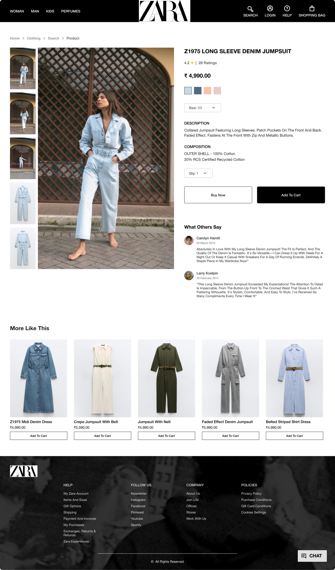
A visually appealing design triggers a favorable reaction in individuals' minds, influencing them to perceive the design as more effective and be more accepting of minor usability issues. I made sure to incorporate ZARA's brand colors of black and white, as well as showcase images of stylish clothing with models on the homepage to highlight their fashionable attire and capture user attention.
The closer users are to completing a task, the faster they work towards reaching it. Therefore, I have revamped Zara's checkout process by implementing progress bars that highlights steps until the order is placed. By providing artificial progress towards a goal, we enhance users' motivation and boost the probability of task completion.

To reduce decision time when response times are crucial, limit choices. Break down intricate tasks into smaller steps to lessen cognitive load. Following this principle, I've consolidated options like overshirts and poloshirts into a single category. Additional filtering options can be provided on the search page after users select a category, mitigating the issue of overwhelming choices.

Users primarily engage with other websites, indicating a preference for familiarity in navigation. Adhering to this principle, I have redesigned the navigation section of zara.com, positioning it at the top with prominently visible links to enhance user experience. Furthermore, I have revamped the product page by relocating product details from the original left-scrolling option to the right, addressing the confusion in user experience.


Establishing a common region fosters a clear structure, enabling users to swiftly grasp the relationship between various elements and sections. To enhance user experience, I created a common region, namely the navbar, by grouping navigation links, login, and search options. By defining a background behind these elements, I improved the overall user experience.

Elements with similar visual attributes are often perceived as related. It's crucial to differentiate links and navigation systems from regular text elements to maintain clarity. In the current design of zara.com, we observe that headings, text, and links share the same font weight and size, resulting in a poor visual hierarchy and reduced call-to-action effectiveness. Therefore, I have redesigned the layout to address this issue, ensuring a perfect visual hierarchy and improved clarity.


If you need a web designer for your project send me an email and I'll be delighted to discuss and fulfil your web design needs. Whether it's a new website, a redesign, or ongoing maintenance, I specialize in creating visually appealing and user-friendly sites. Email me at shlok.freelance@gmail.com to get started on enhancing and completing your web project.
Email Me